As a front-end developer, staying up-to-date with the latest HTML and CSS hacks can help you take your coding skills to the next level. In this article, we'll explore the top 10 essential HTML and CSS hacks that can revolutionize the way you code web applications. Whether you're a seasoned pro or just starting out, these hacks will help you create more efficient, efficient, and visually appealing websites that wow your users.
Introduction
HTML and CSS have been the backbone of web development for over two decades, providing essential tools for structuring and styling websites. As a front-end developer, mastering the latest HTML and CSS hacks can help you code more efficiently, elevate your designs, and create stunning, responsive sites that captivate users. Whether you're a seasoned pro or just starting out, this guide to the top 10 essential HTML and CSS hacks will provide invaluable tools and techniques for optimizing speed, layout, styling, and customization.
Let's dive into these transformative hacks that will help you make the most of HTML and CSS.
1. Optimize Image Performance with WebP Format

One of the most effective ways to enhance your website’s performance is by reducing image load time. Images often make up the majority of a webpage’s weight, so optimizing them can greatly reduce load times. WebP is an image format developed by Google that reduces image size by up to 30% compared to JPEG and PNG formats without losing quality.
Implementing WebP images:
- Convert images to WebP format using tools like GIMP, Adobe Photoshop, Squoosh, or online converters like Free Convert.
Use
<picture>elements with fallback images in case the browser doesn't support WebP.<picture> <source srcset="image.webp" type="image/webp"> <img src="image.jpg" alt="Description of the image"> </picture>
Benefits: By switching to WebP, you’ll see a significant reduction in load times, which boosts user experience and search engine ranking.
2. Leverage CSS Grid for Responsive Layouts
CSS Grid has transformed layout design, making it easier to create complex, responsive designs without relying on heavy frameworks. This layout model allows for two-dimensional layouts (both rows and columns), providing far more control over placement and alignment.
CSS Grid Basics:
Define a grid container and specify the number of columns and rows.
.container {
display: grid;
grid-template-columns: repeat(3, 1fr);
grid-gap: 10px;
}
Advantages: CSS Grid’s flexibility enables you to easily adapt layouts for various screen sizes, create symmetrical designs, and experiment with visual balance without complex calculations.
3. Craft Unique Shapes with CSS clip-path
The clip-path property in CSS is a powerful tool for creating non-rectangular shapes. It allows you to clip (or mask) an element into specific shapes, including circles, ellipses, and polygons.
Examples of Using CSS clip-path:
.shape {
  clip-path: circle(50% at 50% 50%);
}
By applying clip-path, you can create interesting shapes and designs that add a visual appeal to your website. This hack is particularly useful for user interface design, allowing for creative layout options without adding images.
4. Master CSS Grid Stacking for Layered Layouts
CSS Grid Stacking takes your layout to the next level by allowing multiple elements to occupy the same grid cell. By controlling stacking with z-index, you can create visually layered effects that make a design more dynamic.
Implementing CSS Grid Stacking:
.container {
  display: grid;
  grid-template-columns: 1fr;
}
.item1, .item2 {
  grid-row: 1;
  grid-column: 1;
}
Use stacking to add layers to backgrounds, text, or images, giving your design depth and a unique aesthetic.
5. Enhance Responsiveness with CSS Flexbox
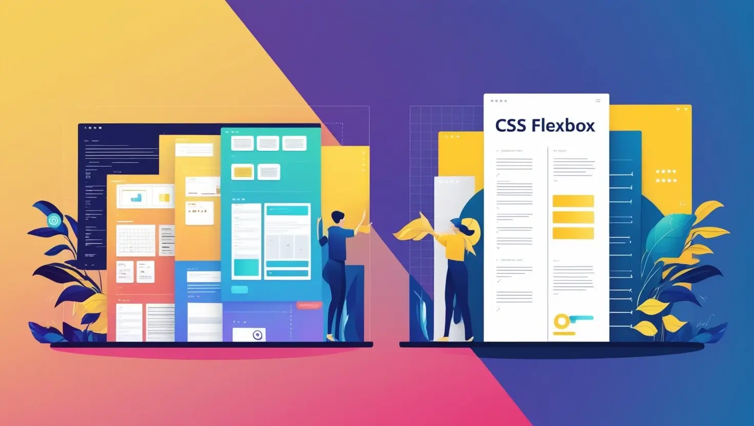
CSS Flexbox is a widely-used layout model ideal for creating responsive, one-dimensional layouts. Flexbox enables elements to adjust automatically within a container, making it an essential tool for responsive design.
Setting Up Flexbox:
- Start by defining
display: flexon the container. - Customize properties like
justify-content,align-items, andflex-direction.
.container {
  display: flex;
  justify-content: center;
  align-items: center;
}
By using Flexbox, you ensure that elements maintain their layout on different screen sizes, improving user experience.
6. Create Multi-Column Layouts with CSS Columns
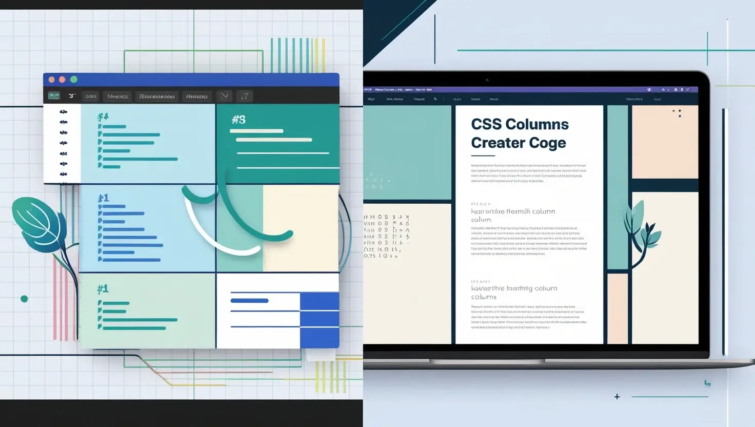
CSS Columns allow you to split content into multiple columns, perfect for creating newspaper-like layouts or for content-heavy sections like blog articles or news pages.
Applying CSS Columns:
.text-content {
  column-count: 2;
  column-gap: 20px;
}Advantages: This property simplifies text-heavy layouts, enhances readability, and keeps pages visually organized without extra markup.
7. Get Precise with Advanced CSS Selectors

CSS selectors are key to applying styles precisely and efficiently. Mastering selectors such as :nth-child(), :not(), and attribute selectors gives you unparalleled control over styling.
Examples of Advanced Selectors:
:nth-child()selector to target specific children:.container div:nth-child(2) { background-color: yellow; }Attribute selectors for input fields:
input[type="text"] {
  border: 1px solid #000;
}
These selectors reduce the need for extra classes, making your CSS cleaner and more maintainable.
8. Customize with CSS Variables for Consistency
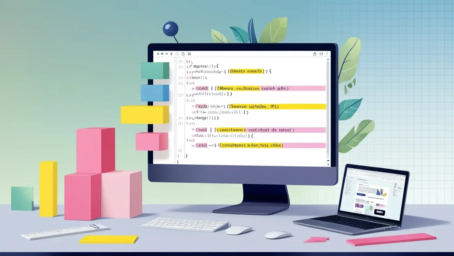
CSS variables, also known as custom properties, allow you to store values and reuse them throughout your CSS. They are perfect for creating themes, managing colors, and ensuring a consistent design language.
Setting CSS Variables:
:root {
  --main-color: #3498db;
  --padding: 10px;
}

.container {
  color: var(--main-color);
  padding: var(--padding);
}
CSS variables are ideal for creating a dynamic and easily customizable style sheet, especially in large projects.
9. Make Interactive Designs with CSS Pseudo-Classes

CSS pseudo-classes such as :hover, :focus, and :active are essential for creating interactive elements. They allow for styling elements based on user interaction, which enhances user experience and engagement.
Example of CSS Pseudo-Classes:
.button:hover {
  background-color: #2ecc71;
}
With pseudo-classes, you can add interactivity to buttons, links, and other elements, creating a more engaging and user-friendly website.
10. Optimize Reusability with Custom CSS Utility Classes
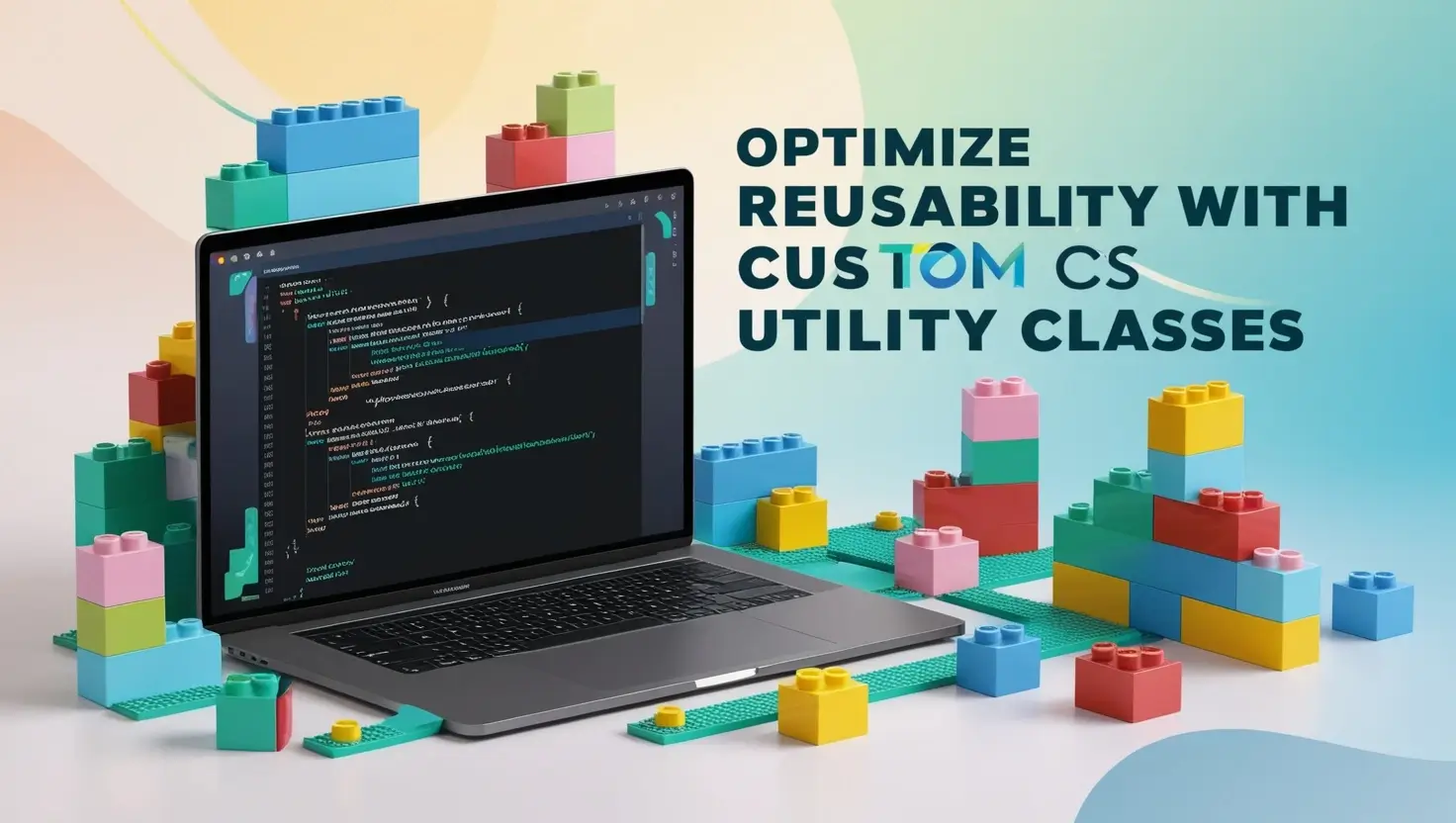
Utility classes provide a method to keep CSS DRY (Don't Repeat Yourself) by creating reusable classes for common styling needs such as margin, padding, color, and alignment.
Example of Custom Utility Classes:
.margin-20 {
  margin: 20px;
}
.text-center {
  text-align: center;
}Benefits: Utility classes streamline the styling process, reduce code repetition, and make maintenance easier. This approach is particularly helpful in larger projects where consistency and efficiency are crucial.
Conclusion
These essential HTML and CSS hacks can drastically improve your workflow, website performance, and the overall user experience. From enhancing image loading speed to optimizing layout with CSS Grid and Flexbox, these techniques enable you to develop modern, responsive, and visually appealing sites. By mastering these hacks, front-end developers can achieve cleaner code, faster load times, and more dynamic layouts that resonate with users.
FAQs
Q1: What are the benefits of using WebP images?
WebP images offer smaller file sizes without sacrificing quality, reducing load times and improving user experience.
Q2: How can I implement CSS Grid and Flexbox together?
CSS Grid and Flexbox can complement each other, with CSS Grid handling broader layout and Flexbox refining specific sections within grid areas.
Q3: What’s the difference between display: flex and display: grid?
Flexbox is ideal for one-dimensional layouts, while CSS Grid is better for two-dimensional, grid-based layouts.
Q4: How do CSS variables improve my workflow?
CSS variables centralize values for colors, padding, and fonts, allowing for consistent design and quick adjustments.
Q5: What are utility classes, and how can they improve my CSS?
Utility classes are reusable styles for common properties (e.g., padding, margins), which reduce repetition and enhance maintainability.
Q6: How can I style buttons with hover effects?
Use the
:hoverpseudo-class to define styles that trigger on mouseover, creating an interactive effect for buttons or other elements.
Q7: How do I create custom CSS utility classes?
To create custom CSS utility classes, use the :root selector and define your classes as properties. You can then apply these classes to your HTML elements for reusability.
Q8: What is the difference between CSS Grid and Flexbox?
Both CSS Grid and Flexbox are layout systems, but they operate differently. CSS Grid is designed for grid-based layouts, while Flexbox is suitable for flexible, one-dimensional layouts. Choose the right tool for your project based on its specific requirements.
Q9: How do I style an HTML element using CSS?
Use CSS selectors to target an HTML element and apply styles using the CSS syntax. For example,
.my-class { color: red; }applies thecolorproperty to elements with the classmy-class.

